Affiliate links on Android Authority may earn us a commission.Learn more.
Creating adaptive, legacy, tab and action bar icons with Image Asset Studio
August 23, 2025
Designing a professional-looking UI is an essential part of delivering a good user experience.
While there’s no shortage of guidelines and advice on how to craft the perfect UI, in this article we’ll be focusing on an area of user interface design that’s easy to overlook: your app’s icons.
We’ll be using Android Studio’s built-in Image Asset Studio to quickly and easily create action bar icons and tab icons, plus adaptive and legacy launcher icons, across all the screen configurations that your application supports.
Once you’ve created these icons, you’ll want to actuallyusethem, so along the way we’ll also be creating interactive action bars and multi-tab user interfaces, ready to display your new icons.

What icons do I need?
Even though we tend to use “app icons” as a generic term, Android app icons can be divided into three distinct categories:
Icon design made easy with Image Asset Studio
Creating multiple app icons can be time-consuming, but if you have Android 3.0 or higher installed then you already have access toImage Asset Studio, a tool that can help you quickly and easily generate all the icons your application needs.
Every time you create a launcher, action or tab icon using Image Asset Studio, it automatically generates alternative icons for all the different pixel densities, and places them in the correct density-specific folders, potentially saving you atonneof time. You can even use the Image Asset Studio to generate a web icon, ready to use in your app’s Google Play listing!

We’ll be using the Image Asset Studio throughout this tutorial, so launch it by selecting “File > New > Image Asset” from the Android Studio toolbar, or by Control-clicking your project’s “res” folder and selecting “New > Image Asset.”
Creating an Action Bar icon
Let’s start by adding an action bar icon to our project:
Depending on the type of asset you select, you may then edit your asset using some, or all of the following options:
Once you’re happy with your icon, click “Next.” The following screen displays the directories where the different density-specific icons will be stored.
By default, icons are stored in the “main” directory, where they can be used by all build variants, including debug and release builds. If you’d prefer to restrict this icon to a specific build variant, then open the “Res directory” dropdown and select either “debug” or “release.”
Finally, click “Finish” and Image Asset Studio will generate your icons, and place them in the appropriate directories.
Getting more out of the Action Bar: Adding icons
Next, you need to display the icon as part of your app’s action bar, by creating a menu resource file and then adding the icon as an element.
If your project doesn’t already contain a “res/menu” directory and a menu.xml file, then you’ll need to create them:
Inside the menu.xml file, create an element for each action bar icon, for example:
The app:showAsAction attribute specifies whether this icon should be displayed in the action bar, or the overflow menu:
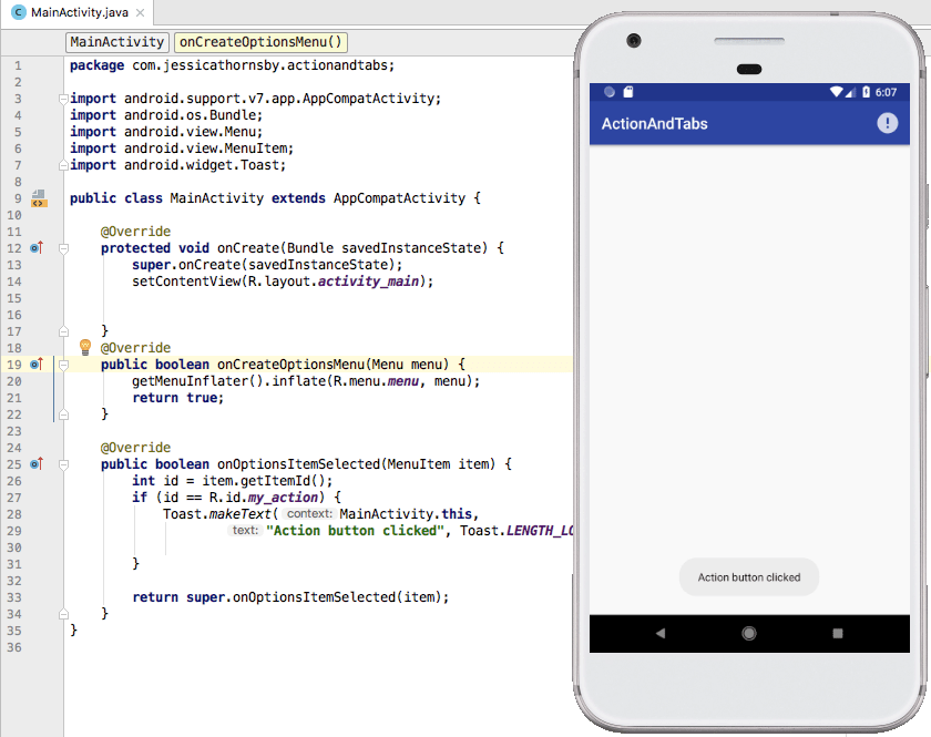
Every time the user interacts with an action bar icon, the system will call your Activity’s onOptionsItemSelected() callback method. You’ll need to determine which icon has been clicked, by calling MenuItem.getItemId() inside your onOptionsItemSelected() implementation, and then stating the action that should be performed. For example, here I’m displaying a toast whenever the user interacts with the “my_action” icon:
Run this app on a physical Android device or Android Virtual Device (AVD), and give the action bar icon a tap – it should respond by displaying a toast.
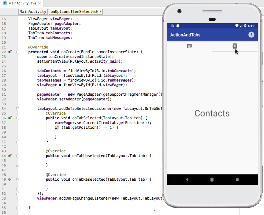
Displaying icons in a mutli-tab UI
You add a tab icon to your project, in exactly the same way you add an action bar icon, so open the Image Asset Studio, select “Action Bar and Tab icon” from the dropdown menu, and then create your icon as normal. In this section, I’m working with two tab icons, “ic_messages” and “ic_contacts.”
Once you’ve created one or more tab icons, you’ll need to create some tabs. There’s several ways to implement tabs, but I’m going to create a TabLayout component and then add each tab declaratively, as an TabItem element. Note that TabItems are just dummy Views that let you set each tab’s text, icon and layout – you’ll still need to define the actualcontentfor each tab.
I’m also implementing a ViewPager, so the user can swipe left and right through the tabs.
You then define each tab’s content in a separate XML file, for example here’s the content of my “fragment_contacts.xml” tab:
Next, you need to inflate the layout for each tab fragment. Here’s my corresponding ContactsFragment.java file:
Rinse and repeat for every tab, for example I’ve also createdMessagesFragment.javaandfragment_messages.xmlfiles.
Since we’re using a ViewPager, we need to create a new class that manages the fragments that’ll be displayed whenever the user selects a new tab. This class must implement the getItem() method, which will be called every time a new fragment is requested. This method uses a switch statement to identify and return the appropriate fragment instance.
Finally, open your MainActivity.java file and use the TabLayout.OnTabSelectedListener method to detect when the user selects a new tab.
This gives us a UI consisting of a “Messages” tab, and a “Contacts” tab.
You’ll find thecomplete code for this project, over at GitHub.
Android Oreo and higher: Creating Adaptive icons
In Android 8.0 and higher, device OEMs (Original Equipment Manufacturers) can provide masks, which the Android system then uses to render all adaptive launcher icons with the same shape, for example an icon might appear circular on one device, and rectangular on another.
Adaptive launcher icons consist of a background and a foreground layer, which you must provide as drawables sized at 108 x 108 dp, without masks or background shadows. These layers are then cut into shape by the launcher, using the mask provided by the OEM.
If your app supports Android Oreo or higher, then you’ll need to provide an adaptive launcher icon to ensure your app is visually consistent with the rest of the user’s device. While it’s good for your application to stand out from the crowd, youdon’twant it getting noticed for all the wrong reasons!
If your app’s minsdkversion is Nougat or earlier, then you’ll also need to provide a legacy launcher icon, which will be used on devices running earlier versions of Android.
You can create an adaptive and a legacy icon at the same time, using the Image Asset Studio:
Once you’ve chosen an asset type, you’re able to tweak that asset using familiar settings such as Trim, as well as some additional options:
Rinse and repeat, to create your icon’s background layer:
Finally, select the “Legacy” tab and specify that you want to create a legacy icon. You can provide this icon in the following shapes: None (a square with sharp corners) Circle, Square (a square with rounded corners), a Vertical rectangle or a Horizontal rectangle.
Once you’re happy with your icon:
If you’re curious about how the background and foreground layers come together to create an adaptive icon, then open your project’s res/mipmap-anydpi folder; it should contain a new XML file that’s responsible for combining these layers.
To use this adaptive launcher icon, open your AndroidManifest.xml file, find the android:Icon attribute and make sure android:icon is referencing the “mipmap” file that Image Asset Studio has just created.
Only supporting earlier versions of Android?
If your app only supports Android 7.1 (API level 25) and earlier, then you just need to provide a legacy icon, which consists of a single layer.
Depending on your chosen asset, you can then edit your icon using some, or all of the following:
Wrapping up
In this article, we looked at how you can use Image Asset Studio to quickly and easily create various icons for your Android apps, and how to use those icons, by creating tabs and interactive action bars.
Do you have any tips for creating effective Android app icons? Let us know in the comments below!
Thank you for being part of our community. Read ourComment Policybefore posting.
